Wednesday, May 31, 2006
This is a nice piece of advertising for the Van Gogh Museum Cafe. The cup plays the role of a visual trigger, resembling the Dutch painter, renowned for his madness attacks and his sufferings in the name of art. It is said that Vincent Van Gogh cut off his ear lobe - which is what inspired this print, probably aimed at art connaiseurs.
get over there...
Part of "The Impossible Team" campaign, Adidas came up with a great outdoor idea in the city of Berlin. They created a footballer-bridge over the highway, starring German goal-keeper Oliver Kahn. Impressive, me might say, and a true positive reinforcement for the power of believing - in yourself, your team, your brand...
Well, it's up to the players now. We wish you a great 2006 World Cup!
Monday, May 29, 2006
Disney's magic
Because everyone longs after those happy childhood moments and because we all need to be reminded of them from time to time. Because a big comfy armchair can instantly transform you into a kid. And because magic exists.
That's why the Disney DVD Classic Series "Feel Like a Kid Again" campaign works.
sinkIN'


making a difference
Aren't you bored of the usual oh-so-black-and-simple sink stopper? Well, then it's time you brought some much needed fun in your kitchen or bathroom! It's time for the Help! sink stopper - a hand grasping for help. It comes in different colours and is an interesting addition to your house. That if you don't mind getting the attention of everybody that comes to visit.
critter love
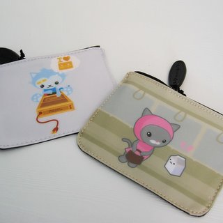

cute is the new black
It's really obvious that cute critters are not only for kids anymore! They're gorgeous on everything, from bags and wallets to T-shirts and mobile/iPod cozies! Meomi design is a great place for all this stuff - they do illustration, animation and they're dedicated to creating cute things.
Handle with love!
Friday, May 26, 2006
hobby-time
Yes, they ARE snails! But not your regular after-the-rain snails...just some woollen ones. As you can see, they come in different colours and they're really funny - I would have never thought that knitting was for such things!
Hurray for hand-crafting.
good vehicle...
A French ad creep idea that aims at preventing road killings. This social ad says "7000 pedestrians killed in Europe each year. Think about it when you're driving". White cloth seeming to cover a body was placed on the road in the form of a zebra crossing, in order to attract attention and deliver the message in a dramatic way.
Good thinking.
oral fun
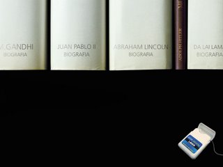
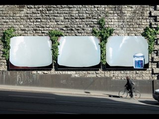
gimme a beautiful smile!
Compared to tooth paste advertising, dental floss doesn't seem to be prone to dullness in the near future. These two examples stand for it, showing that innovative media is the key to keeping it fun.
The first one is for Candida Dental Tape and the second one - for Lider Dental Floss. I like both of them, and, come to think of it, they both speak of "weed" in-between your white shining teeth. Maybe the second one means taking the idea further.
Tuesday, May 23, 2006
thumbs...up!
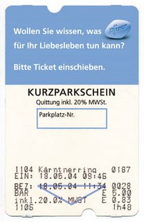
getting the most out of it
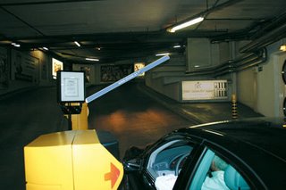
The "blue pill", as everyone calls it, is back with a vengeance! The Pfizer Corporation Austria decided to advertise Viagra on parking tickets. And what a good idea that was!
The ticket said: "Let's see what Pfizer can do for your love life. Please insert the ticket". When inserted, the ticket (of course) lifted the barrier to an upright position. The barrier was also covered in the blue colour of the pill, to enhance the effect.
Nice thinking, guys. We like the visual association.
breaking rules!
Direct Marketing Efforts are more efficient than ever. And they're cuter than ever, too. DDB Germany came up with this one for Pattex superglue. We're talking a "Ming vase" puzzle that the consumer gets to fix, with the help of a tube of Pattex.
This kind of an action shows a lot of trust in the product and it's funny for the receiver, too.
accesorize now
...and I'm sure a creative mind will find some other uses for this multifunctional piece of furniture created by the ostengruppe. The designers thought of an object that would make life much more easier. It can hold things (inside or outside) and it can work as different furniture pieces, depending on your need. Plus, it has a beautiful colour and it's made out of real leather.
No matter how you choose to use it, it'll be downright classy.
Monday, May 22, 2006
and NOT aNOTher laundry ad...
Every advertiser's nightmare + every shopper's nightmare...the LAUNDRY DETERGENT AD! Well...this is a nice blog, with nice people working on it, so we don't want to scare you off. This ad is different (it really is) for at least 2 reasons:
1. it celebrates mother's day;
2. and it uses a conventional road to show an unconventional & sweet idea.
Of course, it reminds women of their everyday "job" once again. And it's not really the most creative of them all. But it looks like a sweet postcard the kids made.
Via TWENTY FOUR.
choco..ndom
This is a very nice ad and it immediately attracts attention. No, not because there's an almost naked lady in it. But because in the "before" photo she's slim, and in the "after" one...well, let's just say she's had one (or some) too much.
So...what's with the invertion? Who would advertise a product that makes you fatter?
First of all, a Belgian company. And second of all, one that sells chocolate-flavoured condoms.
there's plenty in the sea
It seems that besides being a good treat for always-dieting ladies, fish are also heart-friendly because of the large amount of Omega 3 fatty acids they contain. Therefore, they protect the body against cardiovascular disease and they're the reason why Eskimos and a lot of other people live so long and so well.
Of course, this is not the real cause, but only a justification of this post. I just found this picture of tropical fish irresistible and had to work a story around it :)
Via Kirai.net.
Via Kirai.net.
good luck...
A very talented team of people working in a very talented agency from Sao Paulo, Brasil, came up with a cute and intelligent idea of alternative advertising. They "lost" some wallets in strategic places and let them be found. The text inside told the "founder" that now that they have a wallet, they should also learn how to fill it up - by reading the Economia Notebook, belonging to the Estadao periodical.
Involving and inspirational!
innovative empty/full
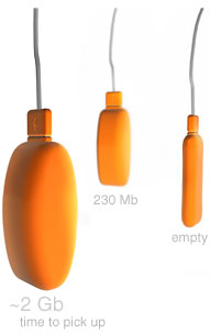
This is a memory stick with a really cool attitude. Russian designer Dima Komissarov from plusminus design had a great idea - what if the classical USB deviced became a little more user-friendly? Not just stocking up data, but also showing you how much spare space there is left.
While the internal memory keeps filling up, the exterior starts pumping and expanding, until there is no more space. In the end, you get a balloon full of info. Not a bad deal, altogether.
light junk
This is an innovative mag ad for McDonald's, presenting their new light menu. Keeping fit'n'healthy is a big issue nowadays and the restaurants, be they classic or fast, try to keep up with it. Of course, at first it might have seemed strange for places like Mc Donald's or KFC or Burger King (and so on...) to offer salads or healthy food. But now, more and more people accept it as a fact and they're at the top of the request.
Could it be that fast is getting slower?
Friday, May 19, 2006
bottled-up energy
attack of the splash
Since the birth of the "no-time" generation, everything has had to be fast and to the point. Why sleep for a few hours when you can get all that energy in a 250 ml can? The day doesn't have enough hours anyway, so that's why energy drinks are the cool substitute right now.
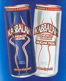
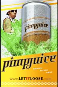
But even so, there's niche marketing around. Profound thinkers & philosophy adepts might try the Kabbalah power drink (via junkfoodblog), while Nelly fans might want a taste of his Pimpjuice (via bevnet.com). Both drinks have a good positioning, and special features, too: "Kabbalah water" for the first and a green neon glow for the latter, 'cause "pimpin' ain't easy". Or at least that's what they say.
whoof-whoof
talk to the dog
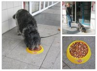
Two nice examples of dogvertising - although we have no idea which one was the first. The idea (for both) is a scented wall or floor at the reach of your pet. It is supposed to make your four-legged friend go crazy for the food.
The first ad is for pedigree (via Ads Of The World), while the second for affinity pet care (via tecnocino). Though the executions are very similar, we salute the idea - talking directly to the dog instead of the owner.
love for waste
Designer Jacco Bregonje thought of an ingenious way to keep the letters he wrote to his girlfriend. A wastepaper basket, what else?
Pieces of the letters are inserted between the PVC sheets, combining plastic with poetry.
Isn't that too sweet to use as a garbage bin?
Thursday, May 18, 2006
hit it!
Any product can have an innovative package, as we can see above. Storm's bowling ball maintenance products immediately gained a new identity when Artifex came up with this idea - transforming the bottle in a bowling pin.
They look very nice and they're surely the cutest products in the whole industry!
uber cool


mice-nice
I simply love the Minnie polka dot bag! It's so sweet and trendy - dots are in this season :)
If you're just as childish and crazy 'bout them, find the giggly pair of mice and other cartoon characters (Tweety, The Pink Panther, The PowerPuff Girls, Miffy etc.) on milksugar.de.
trompe l'oeil
This cash machine is an innovative way to advertise jobsintown.de, a German recruiting company. A very good idea and a very funny one, too.
Wednesday, May 17, 2006
reaching kids' minds


unconventional clothing takes a stand
Designers seem to have a taste for impossible-to-wear clothes, as these two models above show. On the left, there's the "teddybear coat" by Charles de Castelbajac (1988), and on the right - Phillip Toledano's "baby suit"(2006) . The first one is made out of plush teddy bears, while the latter consists of many toy babies stuck to each other. They're both really nice and incredibly ingenious. We'll leave it up to you to decide whether they're art or clothing.
yummy design

lovable & friendly
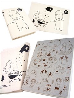
We are totally in love with noodoll's design, whether it's bags, notebooks, dolls or other great stuff. Don't miss any of their work - it's a lot of fun!
Friday, May 12, 2006
ad creeps go to next level
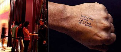
Discouraging drunk drivers & promoting cabs: a good idea that mixes both is also a simple one. Hotel Marriott (India) used these stamps on people entering the Enigma nightclub. Except from being a nice social call, the stamp also functioned as great advertising for the local cab company. It seems the idea caught on so well that even the Mumbai police is thinking of using it from now on.
where art thou, my dear remote?
I have a friend who always loses his remote-control, his keys, his mobile phone, his clothes...Well, you see where I'm getting at. He needs help! And this device is exactly the thing for him (and other airheads).
You attach the small yellow thing on the "precious" object you always lose and then whistle, making it light up and call you by a special sound.
And it's not only for remotes, it can be attached to anything - even your pet, if you are the "hey, where did Mickey go?" type.
Via compactimpact.
flower power


summer shoes
Wear the beauty of summer everyday! The uber-cool shoes at sugar will pump up your style in a second. Their floral patterns and retro looks are totally girly and pretty - but there's also the practical aspect. You can wear them anywhere and everywhere. And yes, all your friends will be green with envy at that grill party.
Thursday, May 11, 2006
bag-ethics
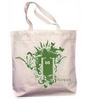
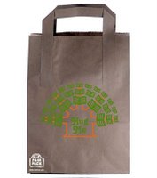
making the right choice
Another humanitarian call, this time in the form of a bag. Fairpack is a non-profit organization that aims at protecting the environment by re-using bags. They produce plastic, paper or cotton bags from recycled materials and militate for environmental-stylish actions. You can re-use a grocery bag and be cool about it - you're doing nature a big favour, while you're keeping up your trendiness.
Next time, at the supermarket, you know what to say: "Thanks, ma'am, I brought my own pack". It's only fair.
more! more! more!
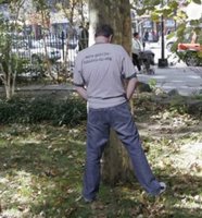
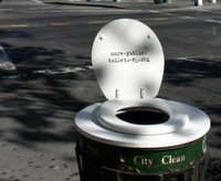
"peace"-making efforts
OK, this is funny, but it's also a serious matter. New York's Privy Council asked Saatchi&Saatchi to come up with something that would make people understand the stringent need for more public toilets. In a city of Big Apple's dimensions, we see the point for doing that. And the advertising is serving its purpose. Above - some examples from the campaign.
We think these ad creeps are great, they're life-inspired and really funny.
girl stuff


surround yourself with flowers
The Flower Collection at edra is stunning! Looks like ambiental design is more than an advertising term now, making its way into lifestyle items, too. These flower chairs look great and we know they're a sure winner with the ladies! And guys, if you want to buy a bouquet that lasts more than a few days, swap the real thing for this one. It's guaranteed to make her feel like a queen!
Wednesday, May 10, 2006
first step to cool
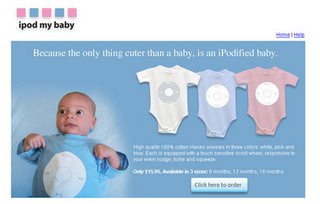
All right, so we all know by now that having an iPod is the trendiest thing on earth. But what about iPodizing your baby? Ever thought of THAT? It might be the supreme proof of your devotion to iPod. I don't exactly see the advantage for the little one, but at least I'd say you're going to hold him/her a lot more. And who is going to be the coolest kid in town?
Tuesday, May 09, 2006
the power of flavor
Yes, we had this question, too. In fact, it's both - as most cool inventions are. The designers of the Najaro Group flavored water thought of this packaging idea that has the fresh look most water bottles don't, but still contains less aluminum than most cans do. So you can call it a hybrid - one that actually works for us. Still, the FlavH2O water "with a fruity splash" attracted some critics, too. People that are fond of bottle caps say the main advantage of a water bottle is the fact that it can be resealed and refilled when empty. And this one can't. True, but that doesn't have to get in the way of appreciating the great design.
Found it here.
Found it here.
big thing
Just today I was talking with some friends about women and their behaviour. We were trying to find general truths about "gal stuff". And here's the summary: phone talking & tote buying. A true 2 in 1 product that is expected to create a new craze. The two most important things for women reunite in just one object - and a pretty darn stylish one, we might add. The purse with a built-in phone is just great! There's only one minor setback - it can't be used as a mobile phone, since it requires a wire to function. But it's still great! I'll just buy one...when I wake up from the "oooah" moment.
Monday, May 08, 2006
preparing for X-mas
Yes, I know what you're going to say: it's only summer! Who needs a Christmas tree now? Well...it's good to be prepared, isn't it? Or...it's nice to remember the holiday season, you know, presents, good food, family&friends...
Hmmmmm...OK then, I'll just say the truth. I thought this was so adorable, I just couldn't help posting it now. It's a Christmas tree in a can...how cool is that?
A Japanese product (notice the easy-to-use-great-design theme), this little tree can be an office plant for a while and then, when it grows bigger, you can plant it outside your house or indoor, in a big pot. It also makes a fabulous gift - mind the nice box and fresh colouring.
I told you, once you see it, you gotta have it!!!


